A High-Speed Digital Experience
The Digital Embassy
3 Months
UX UI Designer
Adelaide, Australia
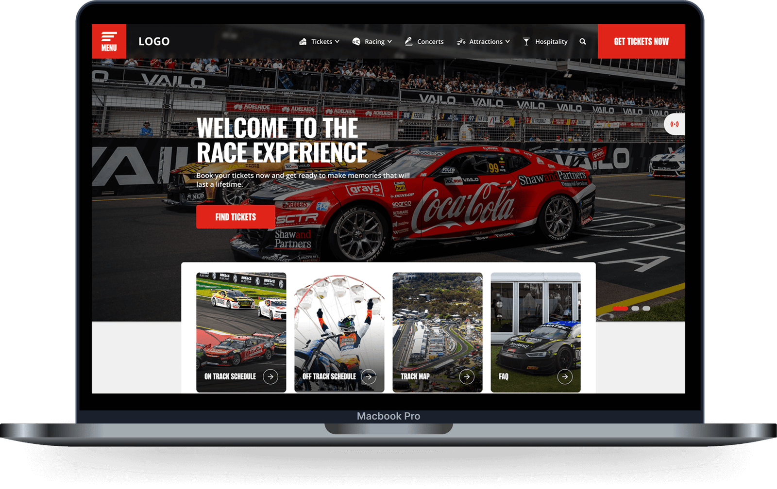
The Challenge - A Digital Pit Stop for Racing Fans
Imagine thousands of race fans, all eager to get the latest updates, buy tickets, and plan their experience for one of Australia’s biggest motorsport events. With over 260,000 attendees across four action-packed days, the existing website wasn’t keeping up with the pace. A new digital hub was needed—one that was not only visually engaging but also user-friendly and capable of handling massive traffic spikes.
That’s where I stepped in as a UX/UI designer for The Digital Embassy.
That’s where I stepped in as a UX/UI designer for The Digital Embassy.
My role?
To craft an experience that would simplify ticket purchases, provide real-time event updates, and ensure seamless navigation across all devices.
The Research - Understanding the Race
This process started with receiving the project brief from the client, outlining all website requirements. After listing the key features, I conducted a heuristic analysis of the existing website, studied the market and target audience, and performed extensive benchmarking to understand how other companies solved similar challenges. Additionally, I held meetings with the team and stakeholders to extract as much relevant information as possible.
From this research, one thing became clear:
From this research, one thing became clear:
Users needed a way to quickly access relevant event information without getting lost in complex menus or endless scrolling.
Defining the Pain Points
After the research phase, I identified key pain points that needed solving. Some of these challenges included:
- Organizing information in a way that allowed users to easily navigate and find relevant content using an adaptive menu.
- Designing a section capable of displaying a large number of ticket options, including individual, family, multi-day, and VIP passes.
The ticketing system was the most complex challenge, and I will explain my solution in detail below.


Designing the User Experience
With insights in hand, I tackled the most critical pain points:
A Smarter, More Adaptive Menu
The Ticketing Challenge
A Dynamic Event Experience
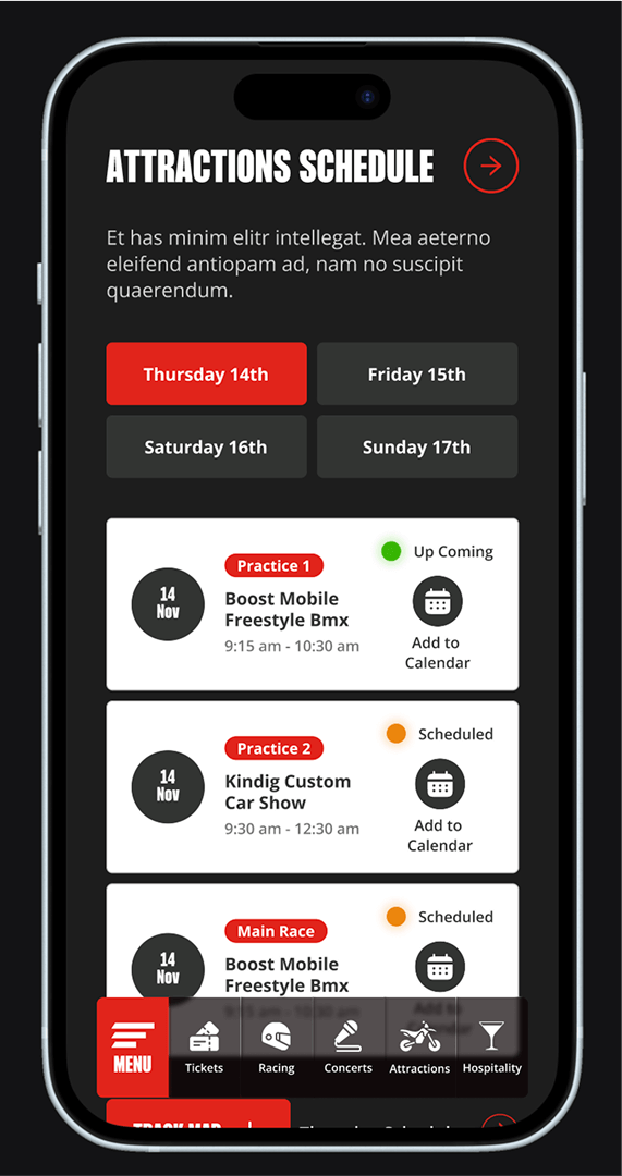
1. A Smarter, More Adaptive Menu
- The website needed a navigation system that worked seamlessly across both desktop and mobile.
- The mobile version required a different approach to layout and structure while maintaining intuitive usability.
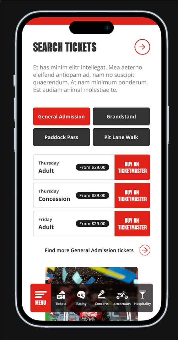
2. The Ticketing Challenge
The biggest UX challenge? The complex ticketing system. With multiple options—single-day, family passes, VIP access, and more—it was overwhelming for users to find the right ticket.
My solution was to introduce an interactive selection system:
My solution was to introduce an interactive selection system:
- When a user selected a ticket, a color-coded map highlighted their seat location and benefits.
- Filters allowed users to sort options by date, budget, or accessibility needs.
- Users could visually see where their seats were located on the track, enhancing clarity and confidence in their purchase.
3. A Dynamic Event Experience
The website needed to adapt to different time periods: before, during, and after the event.
- Before the event: Focus on ticket sales and travel information.
- During the event: Real-time updates on race schedules, results, and live news.
- After the event: Archival content and recaps.
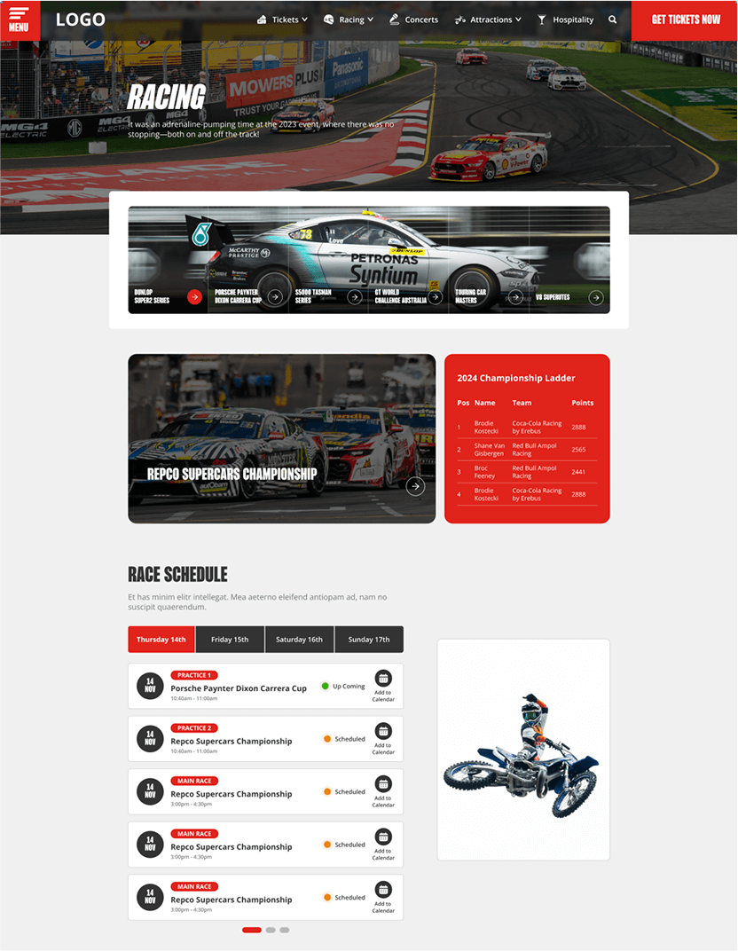
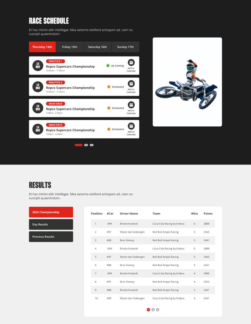
The race schedule and results pages became crucial features, designed with clear filters for users to quickly find the information they needed.
The Results - A Winning Finish
The redesigned website launched ahead of the 2024 event, and the results were nothing short of spectacular:
- 126% increase in new users.
- 178% growth in mobile engagement.
- 129% rise in ticket sales traffic.
- 218,742 website visits and 95,720 sessions during the event.
- Over 55 million content requests processed during race week.
Thousands of attendees accessed the site during the event for live updates, enhancing their experience with real-time information.
A Lesson in Adaptability
This project taught me valuable lessons in:
- Time management: Investing extra effort in interactive prototypes paid off.
- Collaboration with developers: Ensuring clear communication and oversight to bring designs to life accurately. In some cases, developers misinterpreted designs, and time constraints prevented adjustments.
- Process documentation: Keeping a detailed record of decisions and iterations for future improvements.
Want to See More?
For a deeper dive into this project, check it out here.

