A UX Journey
The Digital Embassy
3 Months
UX UI Designer
Adelaide, Australia
Introduction
In the heart of the agricultural industry, a company committed to supporting farmers realised its digital presence was no longer meeting their needs. Information was scattered, navigation was unclear, and users struggled to find the right seeds for their needs.
Recognising the urgency of the problem, the company partnered with The Digital Embassy to breathe new life into the website. That’s where I came in—as a UX/UI Designer, ready to craft a solution that would make the website not just functional, but intuitive and engaging.
Recognising the urgency of the problem, the company partnered with The Digital Embassy to breathe new life into the website. That’s where I came in—as a UX/UI Designer, ready to craft a solution that would make the website not just functional, but intuitive and engaging.
The Challenge
The project came with significant constraints: limited budget, tight deadlines, and no room for extensive user research. But every problem has a solution, and I was determined to find one !
The Discovery Phase
To uncover insights without a large research budget, I gathered the company’s key stakeholders—marketing, sales, development, and administration—into a series of interactive workshops. Through discussions and brainstorming, we pieced together a clearer picture of the issues:
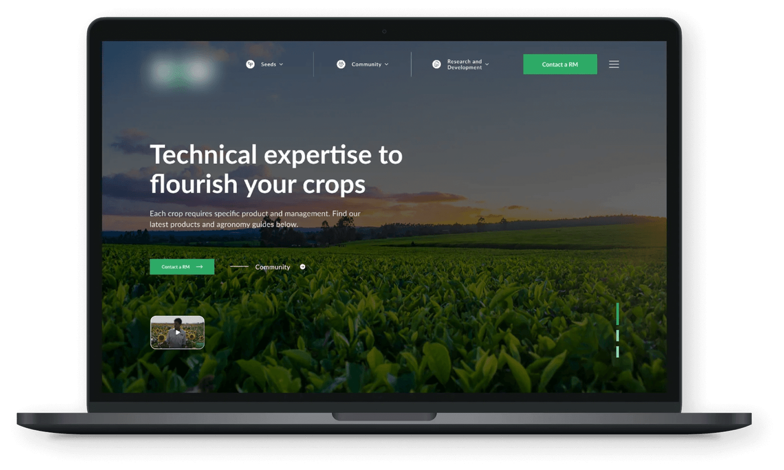
The homepage failed to highlight crucial information about seeds.
Farmers needed a faster way to filter and find products.
The website wasn’t converting visitors into leads effectively.
With additional help from Hotjar analytics, we uncovered key user behaviors:
30 %
of visitors bypassed the homepage and went straight to the "Seeds" page.
60 %
relied heavily on the search function and filters.
21 %
drop-off rate indicated that users weren’t fully engaging with the content.
Designing the Solution
With these insights, we set clear goals:
Strengthen the farming community.
Improve lead qualification by region.
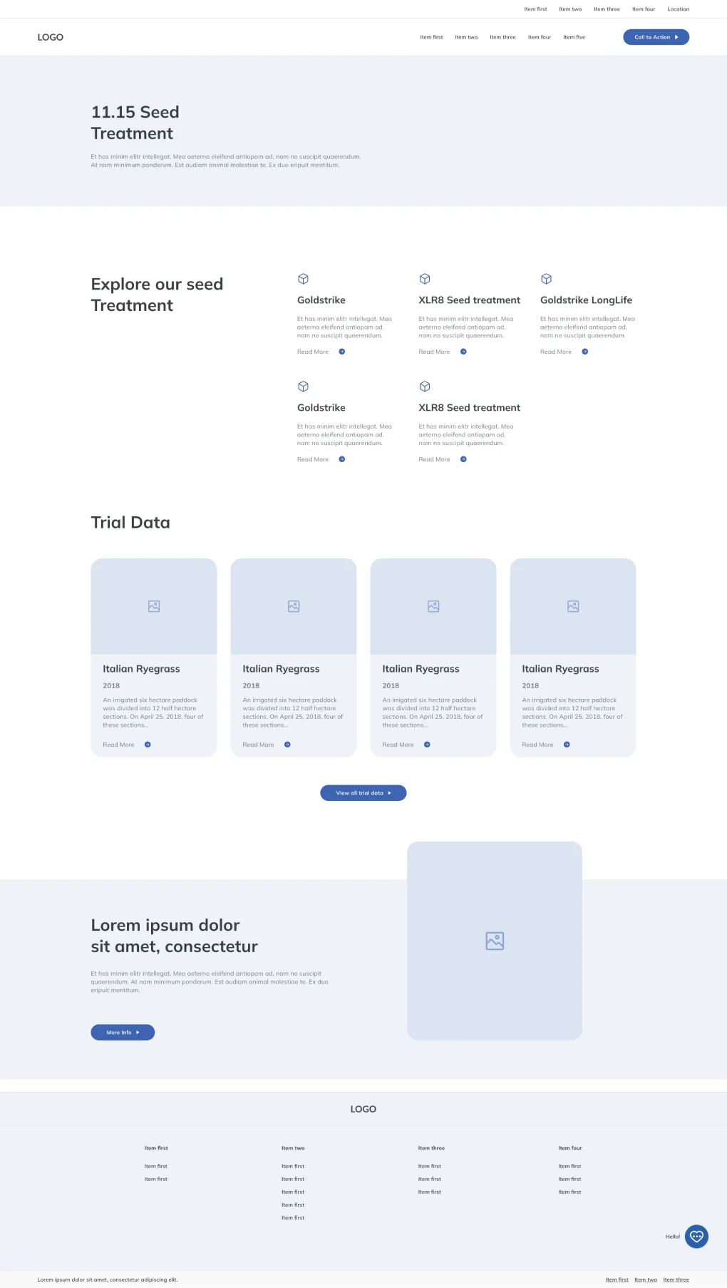
Organize seed information efficiently.
Make the user journey seamless and intuitive.
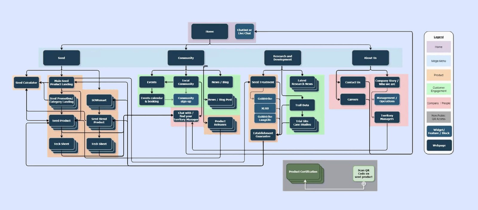
We then mapped out a new site architecture, redesigned the navigation, and developed wireframes. One of the biggest challenges was the menu: it needed to be simple yet comprehensive. Through multiple iterations and internal testing, we crafted a structure that prioritized essential pages while keeping distractions to a minimum.

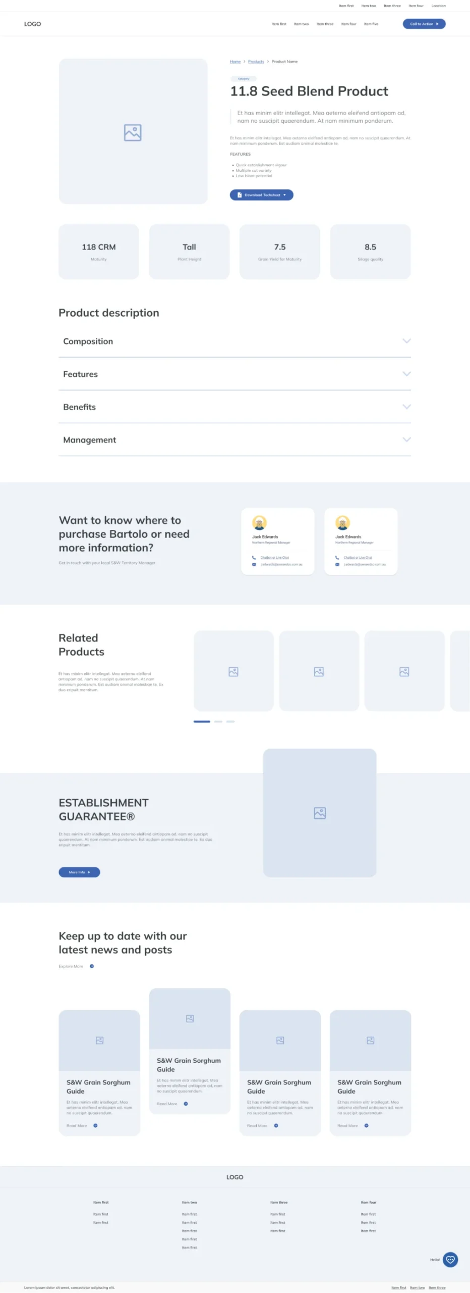
Bringing the Vision to Life
High-fidelity prototypes were created to visualize the new user experience. A design system was established to maintain consistency in colors, typography, and UI components. With internal feedback guiding refinements, we ensured the final product met both business objectives and user needs.
A Lesson in Adaptability
Though budget constraints prevented extensive user testing, this project reinforced the importance of adaptability in UX design. By leveraging stakeholder insights, analytics, and internal testing, we transformed a complex problem into a user-friendly solution.
This experience taught me the power of collaboration and strategic problem-solving, proving that even within constraints, great UX can flourish. The redesigned website now serves as a more effective tool for farmers, guiding them effortlessly to the products they need. And so, with a fresh new digital presence, the company’s mission to support farmers continues—stronger than ever before.
This experience taught me the power of collaboration and strategic problem-solving, proving that even within constraints, great UX can flourish. The redesigned website now serves as a more effective tool for farmers, guiding them effortlessly to the products they need. And so, with a fresh new digital presence, the company’s mission to support farmers continues—stronger than ever before.

